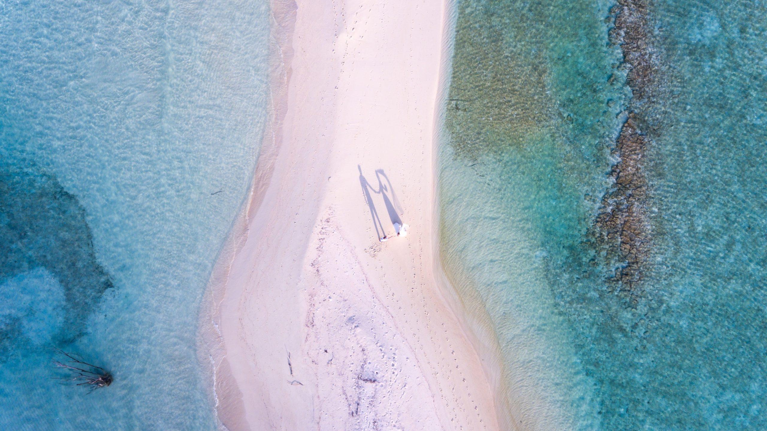
Color is nothing but the essence of energy, excitement, mood, and ambiance in photography and videography. But they can all be misinterpreted if you get the colors in your photographs wrong. Here is a detailed guide on color psychology basics for better video and photos that every professional photographer and videographer should know in order to create pictures and videos with the right impact on their audience.
What is Color Theory?
Color theory is a vast tradition of mixing, combining, and explaining color that dates back to the Renaissance era. Leonardo da Vinci and later on, the scientist Isaac Newton, amongst others, did much to shape our understanding of color. Eventually, in the early 20th century, Albert H. Munsell developed a system of color theory based on hue, lightness, and chroma. Since he launched this color theory system, it has become highly scientific and is being used by various professional photographers and videographers.
When it comes to color theory, there is only one defining rule, but there are also some fundamentals that can help you to understand how colors work together, and the moods, and emotions they can elicit in various ways leading to great effects and settings.
Color Theory Psychology
Colors can easily elicit moods and emotions in people, and different cultures attach a variety of meanings to them. It is the professionals responsibility to capture those colors and show them beautifully in their portraits or videos. As an example, think about the color red within American pop culture; it often symbolizes evil or villains. This color also symbolizes anger, power, love, and even passion. However, in China, red has very different connotations. In Chinese culture, red symbolizes good luck, joy, and happiness.
While there is no one rule dictating the meaning of colors, in color theory psychology, warm colors are usually thought to reflect energy, passion, and happiness, whereas cool colors exude a sense of calmness, serenity, trust, and professionalism. Both warm and cool colors have their own effect on photos and videos. Just think of how many corporate logos are blue! What message do you think that company is trying to send? While it can symbolize calm, blue also suggests sadness or boredom, so it’s mandatory to consider your audience and context when choosing colors. In photography, cooler colors are a good choice for a mellow background, whereas warm colors will jump into the foreground, making them ideal for a highlight or pop of color.
Color psychology is all about how colors make us feel. All colors have a relatable feeling completely based upon centuries of association and natural occurrence.
Using Color Theory in Your Professional Videos
Using colors in your professional videos completely depends on the type of videos you intend to make. Videographers and filmmakers use different colors and artistic lighting techniques which help in telling the stories in the best possible way. For example, think about the iconic green lighting in The Matrix films.
If you are making a marketing video for your client’s business, you will likely want to stay away from overly stylized color choices, make sure you are sticking to what will appeal to your audience, and get the message through your video successfully!
Why is Color Psychology Important?
Using color psychology in the correct way holds the potential to enhance the overall feeling and vibe of an image with a very strong message. It is a strong visual language that professional photographers use to make their viewers react in the way they want. A photographer can easily control the final feeling of a photo simply by using colors in the correct way and ratio. But, there are times when photographers skew messages and make them a bit unclear by not considering the color psychology. For example, using cold and dark colors in a newborn portrait will look strange. The expected feeling of newborn portraits is to be joyful and uplifting, not sad and low. So, a photographer must always know what kind of color psychology to consider whenever they are shooting to have the best results.
How Do Colors Make Us Feel and What Impression Do They Have on Professional Photographs?
As mentioned above, all color psychology carries an associated feeling, sometimes more than one! However, in the end, they all tend to be of similar ilk. Below are examples of common color psychology colors and their potential references. In the further text, each color is explained from the perspective of psychology and how it affects us and photographs.
Black
There is no denying that black is the color of authority and power. This color is very popular in the world of fashion as it is timeless and stylish, with the added benefit of making its wearer look thinner. The black color also implies submission. When used in photographs, this color makes the photo more appealing and powerful. Just like the black and white wedding portraits. They have their own charm and elegance and indeed add a lot of character and drama to any wedding portfolio.
White
White color beautifully reflects light and is believed to be a summer color. White color is a popular color choice in decorating and in fashion because it is light, neutral, and goes with everything. Photographs with white backgrounds add so much light and brightness to any kind of professional shot.
Red
The red color is the most emotionally intense color, this color of love stimulates a faster heartbeat and breathing. Red is often associated with love. This extreme color is generally used as an accent when it comes to decoration. This color when used in a wedding decoration elevates the overall setting and also adds a pop of color to wedding photographs. When captured creatively by professional photographers, this color always attracts attention.
Blue
When it comes to photography, blue is the most popular color. Whether it’s the color of the sky, ocean, or in your subject’s clothing or background creates the best settings to capture professional photographs. This cool color creates exactly the opposite reaction of red. Peaceful, and tranquil blue color causes the body to produce calming chemicals, so it is often used in bedrooms. Blue is also a color that can be cold and depressing at times, depending upon how the photographer is capturing it.
Green
At present, green is the most popular decorating color, as it symbolizes nature. This is the easiest color on the eye and can improve vision. There is no denying that this color is also refreshing. This color is so in trend these days, that almost every wedding photograph has this color in it making it look vibrant and subtle at the same time.
Yellow
Cheerful yellow is nothing but an attention-getter. Considered the most optimistic color, at times this color gets overpowering if overused. So, it is always advisable to use this bright and vibrant color in a perfect ratio. This color when captured in frames always adds more character and charm to the professional portraits. When captured creatively this lovely color will pop out in the background in the best possible way.
Purple
The stunning color of royalty, purple automatically connotes luxury, wealth, and extreme sophistication. With new wedding trends coming every year, a luxurious purple wedding is a dream of every millennial bride out there. A feminine and romantic color, this color gives photography opportunities to professional photographers to capture stunning wedding pictures. This color at times appears artificial as it is rare in nature, but when used with the best combination it offers a great and surreal setting for enchanting and mesmerizing photography opportunities.
Brown
Solid, reliable brown is the color of earth and is abundant in nature. Light brown implies genuineness whereas dark brown is similar to wood or leather. When used in wedding decor, this color brings in the rustic or industrial effect to the overall setting and also gives dark woody tones to the professional photographs. Considered to be sad and wistful, brown color is more preferred by men and is believed to be their favorite color.
We hope that this guide to color psychology for photographers will help you appreciate color in a different light. Just consider everything in your frame when you are shooting.

